Showing posts with label comics. Show all posts

Tuesday, October 22, 2019

Funky Winkerbean - Death of Bull Bushka

Death in comics is rare -- but it's less rare in Funky Winkerbean. It's what keeps the comic interesting for me. Anything that could happen to someone in real life could happen to someone in  Tom Batiuk's comic -- like dying of breast cancer or being a victim of gun violence.

The character of Bull Bushka has undergone many changes in Tom Batiuk's Funky Winkerbean. He was part of the original cast of high school students when the strip launched in 1972. He was the star of the Westview High football team and often bullied the nerdy Les Moore.

In 1992, the strip moved from high school to post-college. Les Moore was an English teacher, and Bull Bushka the athletic coach at Westview. They were colleagues, and Batiuk revealed the Bull's bullying was a reaction to his own father's abuse.

Bull retired from coaching, and over the past two years has been dealing with brain damage. Damage incurred from multiple concussions while playing football. Bull's behavior became more erratic, culminating in this sequence from late September to mid-October, 2019.

Note how Batiuk skillfully weaves together three different story arcs -- the highway patrol's discovery of the wreak, why Bull was in the car, and the gradual realization by his wife that something wasn't right. And all with just three panels a day.


Thursday, March 28, 2013

Lio and the Comics Change 3 - The Rerunuts

Mark Tatulli, creator of Lio, seems to share some of my opinions about newspaper comics. His brilliant story arc last week made several mordant points about the state of the industry, and offered up some humor that worked on different levels. Rather than write one massive commentary about the sequence, I'm break it up into three parts, (The Beginning, The Transition, and The Rerunuts) each examining two days of continuity in detail. 

The Rerunuts

In the final two sequences of Lio's story arc, the newspaper has apparently settled on a replacement for Mrs. Ivanna Laff {Momma], the Rerunuts [Peanuts]. (click on images to enlarge)


Tatulli's made his feelings about Charles Shultz' legacy strip Peanuts clear in previous sequences, like the one below.

And I have to agree. With space on the comics page at a premium, why clutter it up with reruns? Personally, I think giving the space to current comics that might attract new readers would be more productive.

I think that's the point of Tatulli's Rerunuts sequences. In Friday's strip, Lio's father laughs at the Rerunuts' stale gag. Is Lio's question mark indicating he doesn't understand why his father thinks the Rerunuts are funny, or that he doesn't understand the strip's the hopelessly dated reference? Both, I think.

Saturday's sequence ends the story arc.


If space keeps shrinking, will this be
the future of comics in newspapers?
The Rerunuts are in -- they've succeeded in offending the least number of people. And why not? The Jimmy Carter joke would have been inoffensive even when Carter was president. Bloom County, this is not. (And I don't think the final word in the panel is there by accident, either.)

Tatulli goes right to the heart of the problem. Newspapers are continually pressuring comics syndicates to shrink the size of the strips -- presumably to make room for more comics. But what do they do with that room? Waste it with irrelevant legacy strips that do nothing to grow readership. And decreased space impacts the artwork, making it more difficult to create any type of visually engaging comics.

In time, we may be reduced to reading Bazooka Joe-sized strips in the papers -- if they last that long.

Wednesday, March 27, 2013

Lio and the Comics Change 2 - The Transition

 Mark Tatulli, creator of Lio, seems to share some of my opinions about newspaper comics. His brilliant story arc last week made several mordant points about the state of the industry, and offered up some humor that worked on different levels. Rather than write one massive commentary about the sequence, I'm break it up into three parts, (The Beginning, The Transition, and The Rerunuts) each examining two days of continuity in detail. 

The Transition

Wednesday's strip involved some simple word play, taking the name of an actual comic strip literally (click on images to enlarge).
 

Realistic art coupled with grown-up storylines -- no wonder
"The Heart of Juliet Jones" was discontinued.
The Heart of Juliet Jones was a soap opera strip created by Stan Drake in 1953. It ran through 2001, although its heyday was the late 1950's and early 1960's.

Drake was an excellent draftsman, and the realistic drawings of the strip helped the readers take the story lines seriously. And those stories, for the most part, were mostly realistic, too, unlike the over-the-top drama of current TV soaps. That realism, plus a reading public's impatience with long story lines, may have lead to the strip's demise.

Tatulli uses the title of the strip for his gag, but doesn't appear to criticize the strip directly. The next day, though, the knives are back out.


So funny I forgot to laugh.
Although the artwork isn't that close, it's clear Dopey Dog is a parody of Marmaduke. And quite frankly, I wish Animal Control had been called on that pooch long ago. Brad Anderson's single panel comic has been running since 1954, and even as a child I didn't find it amusing. And I own a dog.

I think Marmaduke might still be around because 1) it doesn't take up much space, and 2) it fulfills the mandate Tatulli alludes to in Tuesday's strip -- it offends the least amount of people.

Tuesday, March 26, 2013

Lio and the Comics Change 1 - The Beginning

Mark Tatulli, creator of Lio, seems to share some of my opinions about newspaper comics. His brilliant story arc last week made several mordant points about the state of the industry, and offered up some humor that worked on different levels. Rather than write one massive commentary about the sequence, I'm break it up into three parts, (The Beginning, The Transition, and The Rerunuts) each examining two days of continuity in detail. 

The Beginning:

The first sequence sets the story in motion (click on images to enlarge).


Although Tatulli's technically depicting action in two different comics, the positioning of the strips is important.

First we learn of the changes to the comics page, then we see the results. If you don't know a lot about comics, the gag works. But if you do, the humor becomes even sharper.

Hysterical, no? Ivanna Laff, I really do.
The comics character Mrs. Ivanna Laff bears more than a passing resemblance to Mell Lazarus' comic character Momma.

Personally, I've never really liked Momma. The art was OK, but the characters -- an overbearing, manipulative mother and her three emotionally damaged children never seemed to yield much humor for me.

Not that it couldn't, but for me the gags came across as dated Borscht Belt routines, even when the strip was new in 1970. So seeing this irritating character forcibly removed from the comics page made Lio's Monday sequence gave the gag a delicious edge to it.

The second sequence pretty much sums up the way the industry appears to comics aficionados.


Newspapers don't want innovative strips that further the art and really engage readers. They just want something that will appeal to the maximum number of people But in order to appeal to the most people, it has to be as inoffensive as possible. And while blandness might retain an audience, it won't grow it. And it's an audience that doesn't really care about the product. And these days, I would think newspapers would be looking for engaged readers who would be willing to subscribe because they really need what the paper offers.

I subscribe to the Washington Post (in part) because it has the largest comics section of any of regional papers. Their selection of comics are a selling point for me. Lio's Tuesday's sequence suggests that the newspapers no longer regard comics that way.

Tuesday, June 26, 2012

Pearls Before Zits

I always get nervous when the Sunday funnies are rearranged. That's because it only happens when there's a change in the lineup. Apparently editors believe that readers won't notice a strip's been added (or deleted) if most strips are in a new location.

I had that sense of unease recently when I ran across Zits in a new location. Then, as I read it, I realized that it wasn't the signal of a comics lineup change. Rather, it was an excellent joke by Pearls Before Swine creator Stephen Pastis -- and I completely fell for it. (click on image to enlarge)


Pastis so perfectly captured Jim Borgman's style that I really thought I was reading Zits -- at least for the first panel.

Crossovers between comics can be entertaining, but only if the art works. If the characters are too far removed from their original look, then the reader has to work harder to process what he's seeing, and the humor get lost. Not so with Pastis. This was a masterpiece.

Thursday, November 10, 2011

Meta Tracy

 At first I didn't like the Dick Tracy reboot -- but it's starting to grow on me. I've always enjoyed the work of Joe Staton, from his first comics for Charlton (anyone remember Doomsday + 1 and E-man?) to his most recent work for Femme Noir, a female version of the Shadow. Included in the supporting cast was a policeman who looked a lot like... Dick Tracy.

It looks like Mike Curtis and Joe Staton have been given a bit more freedom than previous have been given a bit more freedom than previous post-creator Chester Gould creative teams. The artwork's picked up in quality, and the writing carries a subtext. One can read the strip at face value, but for the true comics fan there's an interesting subtext.

Take this week's sequence, for example. An old supporting character makes an appearance. When Chester Gould introduced comic strip artist Vera Alldid back in the 1960's, he did so in part to comment on what he saw as a disturbing trend in newspaper funnies. Editors were pushing for  more minimalist drawing from artists, so they could shrink the size of the panels. Also gag-a-day strips were becoming increasingly popular -- two trends that Gould felt squeezed him creatively.

In Dick Tracy, Vera Alldid was the creator of two immensely popular comic strips -- "Sawdust," and "The Invisible Tribe." Occasionally Gould let the reader see some of the strips. "Sawdust" was a play on "Peanuts." In this case, though, the art for each panel consisted of a small pile of dots from which word balloons sprouted. "The Invisible Tribe" carried the concept even further. The panels were blank, and only had word balloons. Take that, you no-talent hacks!

Vera Alldid married Sparkle Plenty (daughter of B.O. Plenty), but when fame and fortune went to Alldid's head, he divorced her and she later married Junior Tracy, Dick Tracy's adopted son.

Curtis and Staton brought him back for the current story arc, and what a change. (click on the images to enlarge)


Alldid's story reflects the state of comics -- especially adventure strips like Dick Tracy. Curtis and Staton are talking to their audience through Alldid. And for those who are comics fans, the final panel of the first sequence is a great punchline.

"Fearless Fosdick" was a comic strip within Al Capp's popular "Lil Abner" strip. It lampooned Dick Tracy, and Chester Gould absolutely hated it.

Times have changed.

Wednesday, October 12, 2011

Prohibition - A Comic View, Part 1

Ken Burns' new series "Prohibition" has brought an unusual piece of American history to light. Not many people, though (including the documentarians) are aware just how thoroughly contempt for the Amendment permeated American society.

I recently picked up  the first volume of a new "Gasoline Alley" reprint series. The volume covers the years 1921 and 1922, when Prohibition was still new. The focus of Gasoline Alley was a group of men and their cars (a hot topic back then), that gradually morphed into a story of a family.

Below are two examples from 1922 of the many I found relating to Prohibition (click on images to enlarge).


In the one above, Walt Wallet, the hero of the strip, talks to his friend Bill about alcohol and how he never used to drink -- before Prohibition.


In the second, Avery shares some of his home brew with Walt -- all very discretely, of course.

Now here's the thing: this was a  comic strip run in daily newspapers all across the country. The humor was considered appropriate for both adults and children (Gasoline Alley was popular with both demographics). Prohibition is treated pretty lightly, here.

If you want an idea of exactly how lightly,  substitute references to marijuana to those of liquor. What if the first strip Walt talked about everyone offering him weed, and how he'd never smoke if it wasn't illegal. Or if Avery offered Walt a joint from marijuana he was growing and Walt made a funny comment about the quality of the pot? Any chance of those gags being run in a mainstream newspaper (either on- or off-line)?

Ignoring  Prohibition wasn't just something hard-core alcoholics did. Everybody did it. And artifacts like these old comics document just how much in contempt the average person held the law.

Sunday, October 09, 2011

Tracy comes to the Alley

This past week was the 80th anniversary of Dick Tracy. After Chester Gould's demise, I thought the strip went downhill considerably, so I haven't been following it (I've shared my thoughts on Dick Tracy before). But I do follow Gasoline Alley, which has had an even longer run. But this past week, the two strips overlapped when Skeezix gets a call from the master sleuth.


Jim Scancarelli uses many of the old tropes from the classic strip; Gould's arrowed notations, and the vintage look of Dick Tracy (like the example below).


It was a nice tribute, and one a long-time comics reader like myself appreciated!

Monday, July 28, 2008

Collecting Cliches

We were poking around one of those antique malls this past weekend, and I was reminded of the Crazy Grandma Comic Book Price Guide at MisterKitty.org.

You hand her a stack of beat up Charlton [comics] from the 70s; next to worthless in anybody's estimation. However, the little old lady manning the antique booth has other plans. "These book for eight dollars each," she says apologetically. And what book would that be, you wonder? Why, the CRAZY GRANDMA COMIC BOOK PRICE GUIDE, of course!

Ever since those freaking baby boomers flashed on their own mortality and started turning every bit of their childhood into age-defying fetish objects, newspapers and Sunday supplements have been running inane little filler pieces all about how those old comic books rotting away in your attic are worth thousands of dollars. And maybe some of them are. But ALL of them are NOT. Beat-up Jughead comics will not put your grandchildren through college, lady.
So true. The articles they refer to (such as the Richmond Times Dispatch's "Love of collecting can pay off") tend to reinforce the perceptions non-collectors about collections by reciting the three collecting cliches:
  1. Collectible items are always worth a lot of money.
  2. Everything old is collectable (especially ephemara).
  3. Some people have enjoyed windfalls -- or even make a living -- buying and selling collectables.
So what is an object really worth? It depends on three factors:
  1. Desirability - most people tend to collect things from their youth. When collecting toy trains became an organized hobby in the 1950's items from the 1920's were hot. In the 2000's, trains from the 1960's are commanding higher prices than before, while the value of older trains has leveled off.
  2. Availability - How many are out there? Pulp magazines from the 1930's have a limited appeal, but every year they become scarcer, keeping the prices high (for some issues only). While they were published in the thousands, pulps were considered disposable entertainment, and many were either thrown out after reading, or perished in World War II paper drives. Those that survived are victims of their own cheap paper, which breaks down over time. Left untreated, a pulp magazine becomes increasingly brittle and eventually crumbles to pieces. It's a small collector's market, but the objects are in very short supply.
  3. Condition - This is part most crazy grandma's don't get. The more common an item is, the more important condition becomes. A tin toy Marklin Battleship from 1914 commands five figures -- even one with scratches and dents. Why? Because it's so rare (and desirable) that condition doesn't affect cost that much. A Matchbox car that's readily available can be worth maybe three figures if it's new and has the original box -- but beat to hell with most of its paint missing, the car's value drops to fifty cents (except in crazy grandma's booth).
Notice age has nothing to do with it. Something made just a few years ago could be extremely desirable and rare, which would drive up its price, whereas something very old that's in plentiful supply will never be worth much.

Age can indirectly impact value, as things tend to deteriorate over time, which can affect availablilty.

Understanding what really determines an object's value can really help the next time you're poking through an antique mall or flea market booth.

So what prompted this post? I found (and purchased) a copy of the Gold Key comic "Total War: M.A.R.S. Patrol" in an antique mall -- mint, in a protective plastic bag, for eight bucks.

- Ralph

Day 44 of the WJMA Web Watch.


Monday, April 07, 2008

Uncircling the Wagons

In a response to my post about citizen fact-checkers, Samuel Brainsample of the "Lots O' Thoughts" blog made very good point.
Cass Sunstein... wrote a book recently about how there is a tendency to surround yourself with like-minds online, and potentially use sorting tools (like StumbleUpon) to filter out news you might not like to hear.
And he's quite right. It's certainly not a new phenomenon. When people in major metropolitan areas had two or more newspapers available to them, the paper one subscribed to often served as an indication of their political preference. Even as newspapers consolidated, that remained true.

I grew up in the Washington area, and it made a difference if one read the Washington Post (Democrat) or the Evening Star (Republican). And after the Star's demise, the Washington Times took over the role as the conservative paper.

And of course the same holds true for TV news. Conservative friends of mine are quite content to watch Fox News and only Fox News because they like the world view it presents. The same is true of radio. Public radio is seen as a liberal news outlet, and Rush Limbaugh et al provide news and opinions for conservatives.

So it's always been easy to build an informational echo chamber that continually reflects back the same views on the same stories -- the Internet just makes the process more efficient. I've talked before about what I call the digital subdivision, and how one be online a good amount of time and only be minimally aware of what's going on.

So how do I use the Internet to keep my world view as wide as possible? Here's what I do:
  1. Rely on reputable news sources that provide a good deal of the basic information many others redistribute.
  2. Never ever listen to talking heads of any persuasion. I prefer the "Oh yeah? Says who?" approach. That is, examining the source materials and forming my own opinion.
  3. Maintain an element of randomness, so that I'm exposed to information I wouldn't otherwise see.
I accomplish this through a mix of websites, podcasts, and newspapers. Here's the ones that make up part of my morning routine:

The Internet
  • BBC International Edition -- A good overview of what's happening in the world. Anna Nichole Smith's death never rated a top headline here.
  • Physics.org -- This keeps me up with the latest science news; accurate and not watered down for the general public.
  • OpenCongress.org -- I don't need my senators and representatives telling me what kind of job they're doing. I can see for myself what bills they're sponsoring, when they're sitting on their hands, and when they're present to vote (and how they vote).
  • ArtsJournal.com -- It keeps me current with what's happening in the arts, both from the creative side, and the business/political side.
  • BoingBoing.net -- A nice compendium of random strangeness (see point 3 above).
  • Digg.com -- This is another of my randomizer sites. Most of the stories are tech-oriented, but sometimes things pop up I'd never see otherwise.
Podcasts
  • Deutsche Welle's "Inside Europe" - A weekly "Morning Edition"-style program that covers the important stories in Europe that we often miss over here (except when the consequences come to bite us in the a**).
  • This Week in Tech (TWIT) - A weekly program of all things tech. Most of the trends discussed turn up in the mainstream media months after the fact.
  • This Week in Media - A little more techy than TWIT, tis weekly program often goes into more detail about media-related issues, production, and developments.
Newspapers
  • The Washington Post -- We get the Sunday edition of this liberal newspaper, primarily for the arts and entertainment features (and the best, albeit shrinking, selection of Sunday comics offline).
  • The Richmond Times-Dispatch -- We get this conservative newspaper the other six days of the week, primarily for state news (remember, I live in Virginia). Although it does have two full pages of comics.
  • The Orange Review -- I live in Orange County, Virginia. This weekly paper is a good way to keep up with what's going on. And sometimes its about the only way.

Putting it down in a list, it seems like a lot, but its not, really. It take me about twenty minutes to read the weekday paper, and another 20 minutes to check the news sites. The podcasts, of course, I listen to throughout the week (primarily in the car).

I like to think I'm getting a broad range of basic information, but I'm sure I have some blind spots. What sites do you recommend?

- Ralph

Monday, March 24, 2008

"Cussin' the Comics" by John Amos

I’m no fan of the “dark” comics. Every now and then, I’ll turn to the funny pages and check out “Blondie” or “Beetle Bailey” or some such nonsense. But I never bother with the dark serious ones, the ones printed with lots of black ink, like “Rex Morgan” and “Judge Parker” and “Mary Worth.”


Dark comic "Judge Parker" (click image to enlarge)

That’s not to say I don’t know about the dark ones. Between my wife and my father, two real comic-crazies, I manage to keep up. I get it all second-hand by overhearing their weekly phone calls.

I’m puzzled sometimes at how two extremely intelligent people can take this stuff seriously. My wife graduated Phi Beta Kappa with a degree in Slavic languages. My father is one of the most well-read people I know. And yet, to hear them on the phone, talking breathlessly about the latest happenings in “Mark Trail,” you’d think they were two teenagers discussing hot gossip.

At least once a week they call each other to yap about the villain stalking Mary Worth or whether Mark Trail is going to catch the poacher with the really bad sideburns.

That'll tell you something: These two actually missed “Apartment 3-G” when it disappeared from The Washington Post a few years ago. And they can tell you everything you ever wanted to know about Prince Valiant, Dick Tracy, or Winnie Winkle. Go figure.

When The Post temporarily dropped “Mark Trail” awhile back, they both flew into a righteous rage. High, high dudgeon ensued. How dare they!

My dad has been a comics fanatic for as long as I can remember. His love-hate relationship with “Brenda Starr, Star Reporter” tended to dominate our breakfast table conversation when I was growing up, especially on Sunday mornings when Brenda was at her most syrupy. This was the strip he loved to hate. I can still hear him, toast in one hand and coffee in the other, ranting about “the frustrated old biddy” who drew the red-headed reporter with the beauty mark on her cheek. He hated the strip’s sappiness and the melodrama. But he kept on reading.

I thought he’d finally give it up when Brenda married Basil St. John, the mysterious guy with the eye-patch. (They named their first child Starr Twinkle). But he stuck it out. He thought it utter tripe, but he read on faithfully.

My wife has been a comics fan since childhood. I’m not sure when she got hooked on the “dark” ones but hooked she is.

We get The Post delivered daily, and I read the sports and the op-eds, and even the Metro section on occasion. But the real reason we subscribe is that my wife needs the comics page. It’s her pressure valve.

She works two jobs, hauls kids from here to there, manages the family finances (such as they are), quilts and knits in every spare minute, and generally keeps our family on an even keel. She’s a woman with a busy life.

A voracious reader, she watches very little television, preferring instead to get her entertainment from books and comic strips.

For her, the dark comics are a sort of soap-opera substitute. She hasn’t got time to lounge around eating bonbons and watching As the World Turns every day. So, it’s ten minutes in the morning over breakfast with Mark and Mary and Sam Driver.

I can’t really account for the fact that I’ve never caught the comics-bug myself. As a kid, I spent hours reading Richie Rich, Archie, and Superman. I love old pulp fiction and even the new, cutting edge graphic novels. Though I try to teach quality literature, I’m a big fan of cheesy, plot-driven stories as well. You’d think I’d be a prime candidate for following the funny papers.

Maybe it’s just that, as an adult, I’ve had no reason to read them. I can get the scoop just by listening in from the fringes.

You hope when you get married that your parents will love and accept the person you’ve chosen to spend your life with. You don’t really know, but you hope.

What you could never predict is that a buzz-cut, tough-guy cop and a brainy girl with a passion for needlework will have a mutual love for “Mary Worth,” “Mark Trail,” and “Spiderman.” I don’t pretend to understand. I just listen in, smile, and shake my head.

It must be a father-daughter sort of thing.

- John Amos
from "Every Now And Then: Occasional Essays"
©2008 by John Amos
reprinted by permission

Friday, March 21, 2008

The Comics Playoffs - Round Three

The past few posts I've been comparing and contrasting two comics: Gil Thorp and Funky Winkerbean. Both recently featured story arcs about girls basketball teams and the differences in execution have been remarkable.

In case there's any doubt, I'm not trying to say one artist is inherently better than the other. Tom Batiuk (Funky Winkerbean) has a very cartoony style. His characters tend to have very simple and stylized faces, economically drawn with dots for eyes, and a single oval (or line) for the mouth.

Frank Bolle (Gil Thorp) draws much more realistic figures. He uses a thinner line which allows for more detail in his faces. His character's eyes usually consist of two or more lines to depict the outline of the eyelids as well as the pupils. Mouths usually have lower lips, and other facial features (such as cheekbones) are drawn in more often in Bolle's work than they are in Batiuk's.

The purpose of these playoffs is to look at how each artist uses the conventions of the comic strip to tell a story -- and in the process bring those conventions to the fore so that you, dear reader, can better appreciate this artform so many take for granted.

In today's example, each panel depicts a basketball team in the throes of victory (click on the image to enlarge). Which one does a better job?


Bolle shows four girls, pairing off to give each other hugs. Two are looking at each other, and the other two are looking.... um (This Week in Milford has an interesting theory). Well, one's looking right at us, the other a little off to the right.

There are some strange motion lines present that give one pause. Is the girl in the back bobbing up and down? And what's happening with the two in the front? The girl on the right is wobbling her head while the one on the left appears stationary (save for her hand which also seems to be going up and down).

I'm not seeing a victory celebration here -- I'm seeing some bobbleheads hugging.

Batiuk, on the other hand, shows us all five girls of the squad. There's a flow to the positioning of them, too. There's a group of three, and then two -- every girl is connected to another, suggesting the connection of a team. If you look at the faces, your eye is pulled along in a straight line and then rises at the end of the panel.

The game announcer's word balloon begins "Moore gets the three!!!" Is there any doubt which player is Summer Moore? Right. She's the one jumping up, her hand signifying "we're number one." If you look at the faces, your eye is pulled along in a straight line and then rises at the end of the panel for Moore. That eye motion reinforces Moore's leap. We not only see it, we feel it.

Bolle uses motion lines to create action. Batiuk uses the reader's eyes to provide it.

Which artist is the better storyteller? After three rounds, IMHO, Tom Batiuk is the new conference champ.

- Ralph

Thursday, March 20, 2008

The Comics Playoffs - Round Two

Yesterday I compared the comic art of Tom Batiuk and Frank Bolle. Both currently depict high school basketball action in their respective strips, at significantly different levels of effectiveness (in my option).

Today we look at the extended action sequence (click on images to enlarge).


In this sequence from Gil Thorp, a key Milford player gets injured. This is the entire sequence -- the strips the day before and after have different scenes. Bolle attempts to show action with motion lines. Speed lines might be more effective. To my eye, it looks like everyone's wobbling like a Weeble.


Look at the first panel. We know that the basket is further away than the girls, but where's the ball? Is it directly over the girl at left? Slightly behind her? Almost to the basket? I'm not sure.
Also, is the Oakwood player really tall, or did she just jump up? The motion lines suggest side-to-side motion (which suggests she's just tall), but the tilt of her body and her waist at the other girls' chest level is more in line with a jump.

I don't know -- and because I have to puzzle over it for a second the dramatic flow of the narrative stops.

And the second panel's similarly confusing. The motion lines make a little more sense, but it still looks like wobbling.

In the third panel, we get the fateful fall -- and the first appearance of speed lines. And that's unfortunate, because they're straight and long, suggesting fast motion and a long fall. To me, it looks like she was dropped from the ceiling! But she still wobbles some.

Fortunately, these pictures are captioned -- otherwise I might be hard-pressed to figure out what the heck's going on!


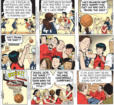
Now let's look at Batiuk (click on the image to enlarge). In this sequence, Summer Moore makes a game-winning shot right at the buzzer. The event is stretched out over three days, heightening the dramatic tension.


The first day sets the stage. We see Summer running down the court in the first panel. In the second, she's surrounded by the other team (we can tell because they're in the foreground, background, and next to Summer). The third panel shows the shot. The angle places the ball in the foreground (so we now it's important), and shows us Summer throwing it up and out of the ring of opposing players.

The second day's sequence freezes time. The first panel serves as a mini-synopsis. And notice that the angle is different. Batiuk uses speed lines to show the arc of the ball, helping us see that it's further down the court than any of the players. The game announcer's word balloons have served as captions for the panels, and in the first day's strip took over a significant amount of the panel space.

In the second panel of the second day, the narrative stops. The last two panels have no sound at all. The second shows the crowd as they follow the ball. The last panel, the players. Time stands still.

The third day we see the result. The ball goes in just as the buzzer sounds. No caption's necessary. The second panel explains the importance of the shot (for those who came in late), and the third winds down the action with Summer's dad and a little comic relief.

When all the elements work together, sequential art can be a powerful narrative medium. Although Batiuk's depiction of people is less realistic than Bolle's, it engages the reader more effectively. Which means we care more about the Westview win than the Milford loss.

- Ralph

Tuesday, March 18, 2008

The Comics Playoffs - Round One

Funky Winkerbean's recent story arc involved a high school girl's basketball team going to the playoffs -- something the sports-related Gil Thorp comic strip does as a matter of course.

Previously I compared how then-current Gil Thorp artist Frank McLaughlin and prospective replacement Steve Bryant drew the same panels. The difference in story-telling technique was remarkable and generated some good discussion in the post's comments.

This time around, it's Gil Thorp stand-in artist Frank Bolle and Tom Batiuk.

Here are two panels depicting game-winning (or losing) shots made just as the buzzer sounds.


In both cases there's no long sequence building up to the shot, so the panels have to stand on their own.

Notice the workmanlike execution of the Bolle panel. The narrative has to do all the heavy lifting here. Imagine the panel without the caption -- we see a ball bouncing off the rim, period. Without the narrative, there's no context for the picture. The caption without the picture still tells the story -- but not the other way around.

Now consider the Batiuk panel on the left. All the elements come together to pull the reader into the story, and the narrative is moved forward by all the elements.

First off, the importance of the shot is told by a word balloon (instead of a third-party narrative caption) -- the announcer's calling the game, and we're listening in. Then there's the sound effect of the buzzer. Gil Thorp tells us it's the last second. Funky Winkerbean lets the sound speak for itself (in a graphic way).

Finally, the image tells us everything we need about the shot. In addition to showing the ball going in, we see members of both teams. The expressions on their faces give us both the elation of victory and the sadness of defeat.

Take away the word balloon, and we still have most of the story.

But not all of it. The word balloon gives us the background information, the sound effect the drama, and the image the emotional context of the action. Having all those elements seamlessly work together to tell the story is the art of comic strip narrative.

Tomorrow -- action on the court!

- Ralph

Wednesday, February 20, 2008

Milford Metamorphosis

By some strange coincidence, my posts comparing two artists illustrating the comic strip Gil Thorpe happened just at the right time. On Monday, when my initial post went up, Frank Bolle debuted as the strip's new artist, replacing Frank McGlaughlin.

While I sometimes write posts on the fly in reaction to events (like this one), for the most part, I normally jot down topics as they occur to me, and fill them out at a later date. That's what happened with my last two posts. I had been meaning to write about Steve Bryant's tryout strips for a week or so. According to Bryant's blog, he had been asked to submit some samples, but he had no details about if -- or even when -- the Chicago Tribune Syndicate wanted to replace McGlaughlin.

We can't do a direct comparison, but here's Bolle's depiction of high school basketball action placed against Bryant's.


(click on image to enlarge)

Zowie. I think I prefer Bryant's snapshot style (panel 2) to Bolle's attempt to show action with speed lines (panel 1). It just makes all the players look like they're trembling.

Bolle is an experienced comic strip artist, which I'm sure was an important part of the syndicate's decision. They know he'll produce on deadline and at a certain minimum level of quality on a consistent basis.

But compared to Bryant, his style looks a little flat to me. Plus, Bolle is really experienced -- he's 83. Bryant's almost half that age.

It seems strange to me that they would bring in a new artist who's near the end of his career. Every artist change disrupts the readership somewhat. To have to do this again little ways down the road seems short-sighted, somehow.

- Ralph

Monday, February 18, 2008

The Art of the Comic Strip Narrative, Part 2

Yesterday's post comparing two different ways of presenting the same comic strip continuity generated some insightful commentary from readers. From the same sources here're two other examples placed next to each other.

The comic strip on the top was drawn by Frank McGlaughlin, the official artist for Gil Thorp, and was published a few months ago. The bottom strip is a tryout by Steve Bryant, created at the request of the Chicago Tribune.


Unlike yesterday's example, there are strong storytelling elements in both versions. The script requires three different speakers and a scene change. McGlaughlin starts out the reader in the team bus, showing us the two coaches in a discussion.

If you haven't been reading throughout the week, it may take a moment to figure out where they are. Bryant shows us the bus in transit, clearly setting the stage, but there's a trade-off. We don't know who's speaking (unless we've been reading the continuity throughout the week).


(To be fair, Bryant used the text supplied by the Syndicate. Had he been the actual artist working with the writer, it's possible that the dialogue could have been slightly tweaked so that Kaz and Gil mention each other by name.)

In McGlaughlin's version, panel 2 has Gregory sitting in the back of the bus, his pose showing he's not been humbled at all by the talking-to referred to in panel 1. He's also looking up as if seeing himself on an imaginary pedestal. His two teammates seem less than impressed.

Bryant has Gregory address the reader directly (while seeming to talk to someone off-panel). How big is Gregory's ego? Big enough to break the fourth wall! On the downside, the way Gregory and his fellow passenger are dressed give us no indication that they're members of a high school basketball team. McGlaughlin's choice of varsity jackets did the narrative a greater service in that respect.

For the third panel, we have Gregory's ex-girlfriend (Maureen Monte, right) and her friend Anne Mayers (left) talking about his ego. Notice the nice arc the story provides. We start with the coaches talking about how they hope Gregory's attitude is under control, the middle panel Gregory refutes that assumption, and in the last two other people provide additional evidence to show just how conceited he really is.

McGlaughlin gives us a clear change of scene by filling in the background and showing us a girl's bedroom. The two girls, albeit drawn somewhat awkwardly, are in poses typical of teenagers lounging. Although the setting is clear, the cell phone with exhibit A (the texted scores) is kind of difficult to make out.

Bryant's far more economical in his scene change. The first two panels have frames, the last one doesn't. By drawing the girls closer in, he can show the cell phone. McGlaughlin has the girls staring off into space, which doesn't help. Are they engaged in conversation or is Anne just thinking out loud? Bryant has both girls' attention focussed on the phone, which draws our eyes to it, too.

Plus, by having the brunette dressed in a light-colored top, the phone stands out in contrast. McGlaughlin chooses to draw a black phone in front of a black sweater.

The downside to Byrant's portrayal is that we're not sure where the girls are. They could even be on another part of the bus, for that matter (letter jackets in panel 2 would have helped that somewhat). On the plus side, he breaks up Anne's lines into two connected word balloons. As mentioned yesterday, it suggests a pause in the delivery, and the second balloon's position over Maureen's head indicates that the comment came after Anne was shown the text message.

If I had to choose, I would say that Bryant's the better artist overall -- and his website shows that he's well-steeped in the comics tradition. Still, continuity strips with their many constraints present a unique set of challenges to the graphic storyteller who usually has a whole page to play with.

I'd almost call this one a draw. No pun intended.

- Ralph

Saturday, October 06, 2007

Death in Comics -- the passing of Lisa Moore

I've previously discussed the concept of death in the daily comics, albeit as part of an examination of the success of "For Better or Worse." This past week Lisa Moore, a major character in "Funky Winkerbean" died of cancer in a particularly well-thought out sequence.


Some folks I know (and I suspect the majority of newpaper comics readers) just don't understand the appeal of a contining story strip. If it doesn't setup and deliver a gag in three panels, then what's the point? They preceive such strips as boring, and cannot comprehend why death is even in the comics at all.

I'll concede that to someone who's used to a comic to begin and end a story in three panels might think a story arc running over several weeks to be moving at a glacial pace. And yes, death is unpleasant, but (used properly) very necessary.

The reward of reading a continuing strip is that increasing familiarity with the characters and thier backgrounds adds depth to the story and greater impact to the conflict. And when one of those characters that you've read about and become attached to over the years shuffles off this mortal coil, it can be a very moving experience.

Lisa's life and death are a good example of those rewards.

We first met Lisa in high school. Fellow student Les Moore had a crush on her. He was one of the few to stand by her when she became pregnant (by someone else). We read on as Lisa put her baby up for adoption, and dealt with the emotional fallout of teen pregnancy.


In adulthood, we saw Lisa battle breast cancer. We read about the courtship of Les and Lisa, and her struggle to finish law school and make something of herself. We saw them purchase their home, and watched them raise their daughter.

So when Lisa's cancer returned, the emotional impact was greater for the long-time reader. It wasn't fair -- this shouldn't be happening to Lisa, who's lived through so much. Knowing how hard she had worked to set up a practice, it meant something to us when her deteriorating health forced her to take down her shingle.

When Darin Fairgood recently discovered Lisa was his natural mother and reunited with her, our knowledge of her guilt over giving up her baby made it a poignent moment indeed.

Even her final wish to see the leaves again resonated with long-time readers. For years, Batiuk ran an autumn sequence about leaves falling off the trees. For the leaves, dropping off the branch was death. For those who caught the reference, Lisa's last wish had added meaning.

We forget sometimes that "entertainment" isn't always synomemous with laff riots. Any story that elicits an emotional response -- be it joy, sadness, fright, nostalgia, or whatever -- is entertaining. By that definition, the passing of this comic strip character on Thursday, October 4, 2007, was very entertaining -- moreso for me than that day's episode of "Garfield."

- Ralph

Thursday, October 05, 2006

The Age of Gould

October 4 marked the 75th anniversary of the premier appearance of Dick Tracy – which led me to a contemplation of newspaper comic strips. When Chester Gould started the strip, the field was bursting with possibility, sort of the Internet today. By the early 1930's the funnies had settled into fairly high level of sophistication, and appealed to readers of all ages.

Newspaper editors, who for most part endured rather than nurtured the genre, continually pressed for smaller panel sizes, not to squeeze more comics in, but to make room for more advertising. While the gag-a-day strips coped with the compressed formats, the adventure strips suffered greatly. And that's a shame, as there was (and is) virtuoso storytelling going on here.

While I followed Dick Tracy in the Washington Post throughout my formative years, I've since given up on the strip. The creators are clearly hobbled by strictures to not stray far from the Dick Tracy staples – grotesque villains, the return of classic villains, character traits spelled backwards or used as puns for names. What's left is a living dead strip.

When Gould drew and wrote the strip, it crackled with energy. Gould never plotted – he would dump his hero into a fix, and then figure out how to get him out of it. Some of his most memorable sequences involved elaborate crimes that unraveled quickly and then degenerated into a long, drawn out chase.

Some of these sequences lasted six months to a year, but the public loved it. Today, all strips with a continuing story are pushed to keep the story arc short. And I've heard friends dismiss the adventure strips because the stories move too slow! What's the rush? As long as you're looking forward to what's going to happen next, who cares how long it takes? Some of the best strips still manage that feat today – even with reduced panels. Gould was the master at it.

While Dick Tracy has not fared well after the death of Gould, some other strips have managed to not just continue, but actually build on the accomplishments of their original creators. Below is a short list for your consideration.

So what does all this have to do with consumer electronics? Simply this: as new things come along, old things get discarded (like your eight-track tapes). And while change is good, sometimes its worth taking a moment to realize that some of what we're leaving behind is worth our appreciation, too. See you in the funny papers.
- Ralph

Brenda Starr – started in 1940 by female artist and writer Dale Messick, the strip continues with Mary Schmich, who draws on her journalists' background for stories, and artist June Brigman.

Judge Parker – started in 1952 by Nicholas P. Dallis (writing as Paul Nichols) and drawn by Dan Heilman, now written by Woody Wilson, and drawn by Eduardo Barretto, who worked for DC Comics.

Prince Valiant – started in 1937 by Hal Foster, now written by Cullen Murphy, who has a degree in medieval history, and drawn by Gary Gianni, late of DC Comics.

Rex Morgan, MD – started in 1948 by Nicholas P. Dallis (writing as Dal Curtis) and drawn by Marvin Bradley, now written by Woody Wilson and drawn by Graham Nolan who had previously done comics work for both Marvel and DC.