Yesterday I compared the comic art of Tom Batiuk and Frank Bolle. Both currently depict high school basketball action in their respective strips, at significantly different levels of effectiveness (in my option).
Today we look at the extended action sequence (click on images to enlarge).
In this sequence from Gil Thorp, a key Milford player gets injured. This is the entire sequence -- the strips the day before and after have different scenes. Bolle attempts to show action with motion lines. Speed lines might be more effective. To my eye, it looks like everyone's wobbling like a Weeble.
Look at the first panel. We know that the basket is further away than the girls, but where's the ball? Is it directly over the girl at left? Slightly behind her? Almost to the basket? I'm not sure.
Also, is the Oakwood player really tall, or did she just jump up? The motion lines suggest side-to-side motion (which suggests she's just tall), but the tilt of her body and her waist at the other girls' chest level is more in line with a jump.
I don't know -- and because I have to puzzle over it for a second the dramatic flow of the narrative stops.
And the second panel's similarly confusing. The motion lines make a little more sense, but it still looks like wobbling.
In the third panel, we get the fateful fall -- and the first appearance of speed lines. And that's unfortunate, because they're straight and long, suggesting fast motion and a long fall. To me, it looks like she was dropped from the ceiling! But she still wobbles some.
Fortunately, these pictures are captioned -- otherwise I might be hard-pressed to figure out what the heck's going on!
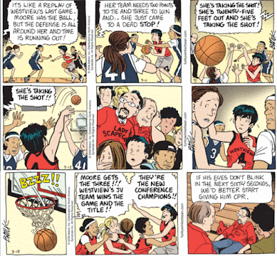
Now let's look at Batiuk (click on the image to enlarge). In this sequence, Summer Moore makes a game-winning shot right at the buzzer. The event is stretched out over three days, heightening the dramatic tension.
The first day sets the stage. We see Summer running down the court in the first panel. In the second, she's surrounded by the other team (we can tell because they're in the foreground, background, and next to Summer). The third panel shows the shot. The angle places the ball in the foreground (so we now it's important), and shows us Summer throwing it up and out of the ring of opposing players.
The second day's sequence freezes time. The first panel serves as a mini-synopsis. And notice that the angle is different. Batiuk uses speed lines to show the arc of the ball, helping us see that it's further down the court than any of the players. The game announcer's word balloons have served as captions for the panels, and in the first day's strip took over a significant amount of the panel space.
In the second panel of the second day, the narrative stops. The last two panels have no sound at all. The second shows the crowd as they follow the ball. The last panel, the players. Time stands still.
The third day we see the result. The ball goes in just as the buzzer sounds. No caption's necessary. The second panel explains the importance of the shot (for those who came in late), and the third winds down the action with Summer's dad and a little comic relief.
When all the elements work together, sequential art can be a powerful narrative medium. Although Batiuk's depiction of people is less realistic than Bolle's, it engages the reader more effectively. Which means we care more about the Westview win than the Milford loss.
- Ralph


No comments:
Post a Comment